5 Tips How to Accessorize your Room
How do you create a perfectly curated space through accessories?
Keep in mind these 5 decorating tips:
- The Rule of 3 - This rule is tried and true. The Rule of 3 is a well known rule. It works in design, photography, and writing. Presenting information in three creates a grouping that is more memorable than even-numbered groupings. Three seems to be the magic number but 5, 7, and 9 work nicely as well. Three is the smallest number that can be used to form a distinguishable pattern in our heads. The grouping must include variety. When grouping accessories in three’s, I like to create an “A” shape. Curate items of varying heights, texture, and shape. In the example below, you can see the "A" or visual triangle that was created withe the mirror, table lamp, and picture frame.
(Image via Architectural Digest)
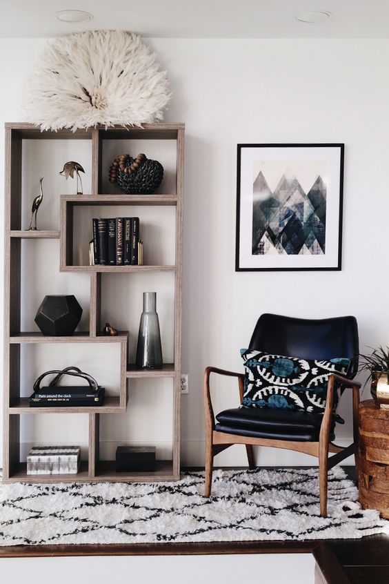
2. Balance - Balance refers to the visual equality of objects and furniture in a room. Balance is needed to give the eye a visual break so the room doesn’t feel visually disorganized/cluttered. When creating the illusion of balance, you aren’t necessarily using items that are physically the same. For example, you may have a bookcase in the corner of your space, to add balance try adding an object of similar height such as a floor lamp or an indoor tree. In the example below, the bookcase is balanced by an armchair with a piece of artwork above.
(Image via Ashley Redmond)
3. Scale - Scale is the proportion between your furnishings as well as how they fit in with the rest of the room. This rule can be applied when accessorizing as well. If you have a large sofa and hang a small piece of artwork above it, then the art would feel lost. When selecting art or accessories for your space, make sure that they compliment and proportionate with the object you are pairing it with.
4. Layering - Layering involves placing items in front or behind each other to create to create a collected look. Whether you are accessorizing a single vignette or an entire room, layering creates dimension and adds texture. A room that is layered looks well decorated and collected. I like layering artwork on a mantle or on a floating shelf (because I like to switch art out and it also puts less holes in the walls). In the example below, the abstract artwork serves as a backdrop for decorative vases, sculptures, and a traditional table lamp.
(Image via Theneotrad.com)
5. Contrast - Contrast is the combination of opposite elements in a room. Contrast can be created through 6 elements, which are: color, pattern, style, shape, size, and texture. High contrast rooms (rooms with a lot of contrast) creates more energy or can feel busy. Low contrast rooms will feel more calm and quiet. Depending on the feeling and function of the space, each type of contrast is necessary to design a space. Your bedroom is an area where low-contrast is important. In rooms that you are less likely to spend a portion of your time in, high-contrast is a good space to experiment with style risks such as a powder room or mudroom. In the example below, a living room used high-contrast to create a playful and inviting living area.
Want more design tips and inspiration?
- Follow me on Instagram! @byamadesigns
- Join me in FREE Webinar! I will be hosting a Live Master Class on Space Planning. Reserve your seat!
- Sign up for my VIP List and receive inspiration each month


