There comes a time where a child outgrows their bedroom and develop their own personal style. The once “cute” kids bedroom is now not-so-cute anymore, and perhaps starting to feel a little embarrassing when friends come over. I recently had the pleasure of designing a teen girl’s bedroom in West Caldwell, NJ. I transformed the teen bedroom in one weekend with the help of my team and our Styled in a Day service.
THE BEFORE
Before, the bedroom furniture layout had the armoire as the focal point when you entered the room. While the armoire has great visual presence, it lacks enough width to fill the entire wall which creates dead corners. Dead corners in a bedroom often become a dumping ground for "stuff". For teens, this becomes the "I'll do it later, Mom!" pile.
BEDROOM BEFORE
At any age, everyone has stuff. There is no getting around that. However, it's a matter of creating a functional layout for the beholder and developing a system that makes sense.
Aside from the layout and storage design dilemmas, this room also lacked other important functions.
During my initial consultation, my client’s daughter and I had talked about what purpose her room serves, asides from sleeping. Her bedroom is a place to hang out with friends, relax after school, and a quiet place to focus on homework.
With that in mind, this bedroom had no place to physically do homework — there was no desk! She was doing homework from bed, which obviously isn’t the most efficient (or productive) way to get homework accomplished.
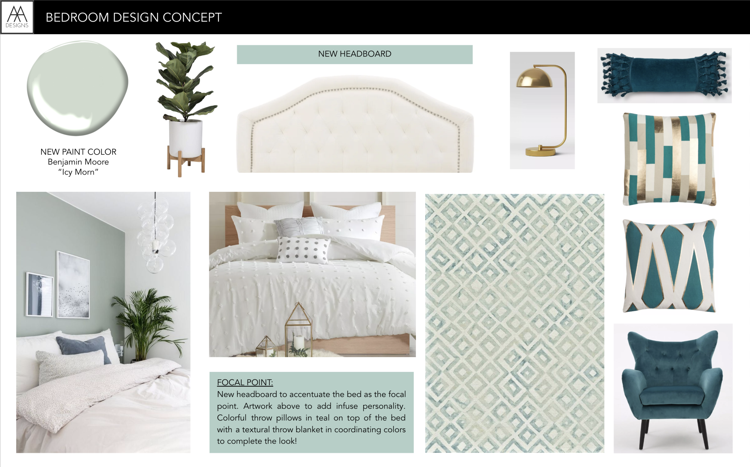
Once the function of the room was defined, we talked about the design and she had picked her favorite color from my paint deck, which was Benjamin Moore’s “Icy Morn,” color 457.
Based on her favorite color, feedback, and the function of the room; I created a concept board to present to her with the vision for the room before I went shopping.
THE design CONCEPT
Teen Bedroom Makeover Concept Board by AMA Designs & Interiors LLC.
THE FINAL REVEAL
The bedroom now has a “wow factor” when you enter. By moving the bed to the opposite wall, adding a headboard, and artwork above — the bed makes a statement, rather than getting overlooked.
Since the entire wall has been utilized with a more functional furniture layout, the dead corners have been eliminated. Therefore, there are no piles of stuff that can accumulate anymore. I also streamlined the "getting ready" process by relocating the wardrobe cabinet next to the closet door (not pictured). This way, clothing can be easily accessed in one central location. Plus, there is a hidden hamper that is tucked away for worn clothes. Now, they can’t end up on the floor. Everything has a place and every function has been carefully considered.
Speaking of function — did you notice the desk to the right of the bed? With the new furniture layout, I was able to fit her existing desk that was previously located in another room. Now, she can efficiently do homework in the bedroom with a view of the outside for a creative boost. The desk doubles as an additional bedside surface too.
I utilized all the existing furniture, with the addition of a new headboard, lucite desk chair, and the teal velvet chair in the corner. I also incorporated all new accessories, artwork, bedding, curtains, and area rug to anchor the bed. The finishing touches and decor were a surprise during the big reveal after I had finished styling.
“Amanda transformed my daughter’s bedroom from Little Girl to Teenager — what a difference! She met with my daughter to discuss her vision for the room. Amanda has such a great personality, that she [my daughter] felt instantly comfortable with her. The room looks amazing! She has been keeping it clean and making her bed since!”
The best testimonial of all! It makes me smile to know that my client’s daughter is so happy and proud of her new room that she is taking care of it, on her own! Imagine not having to nag your teen to clean their room? No asking. No nagging. Just inspired action.
That is the power of a great design transformation. What do you think of the final result? Comment below. I’d love to know what was your favorite part of the transformation.


