DIY

Reasons Why you Should Hire an Interior Designer

Reasons Why you Should Hire an Interior Designer

Regardless of the scope of your project, any home project is an investment. We manage projects anywhere from full-room decoration to full-scale renovation. When you are investing thousands into your home, the thought of professional fees for an Interior Designer may raise concern. However, you know in your gut that you don’t have the time or bandwidth to take on the project yourself without the help of an expert.

The value of hiring a professional Interior Designer far outweighs the monetary value.

How to Define your Design Style

Tell me if this sounds familiar: You just moved in or are looking for a new home, you started shopping around online, you made Pinterest & Houzz inspiration boards, you bookmarked all your favorite items, you watched reruns of HGTV shows, you took notes from a YouTube video on how to DIY everything, and you have been stock piling coupons for Bed Bath and Beyond like nobody's business. You did the research and you gathered inspiration but where do you start? I’m here to tell you how in this blog post!

Teen Bedroom Update

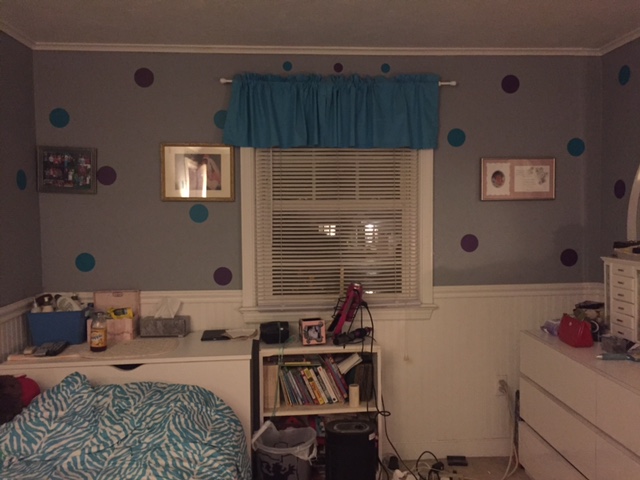
A full room transformation is not always necessary to make a room feel new again. In a recent project that I have completed, I transformed a teen bedroom with accessories, bedding, and new window treatments. Before I started the project, the room lacked a functional layout. The desk was shoved into a corner and their was no vanity area for the teen girl to get ready for school. Plus, the only lighting available was from a floor lamp.

IMG_3376 (1)

IMG_3377 (1)

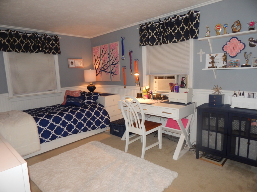
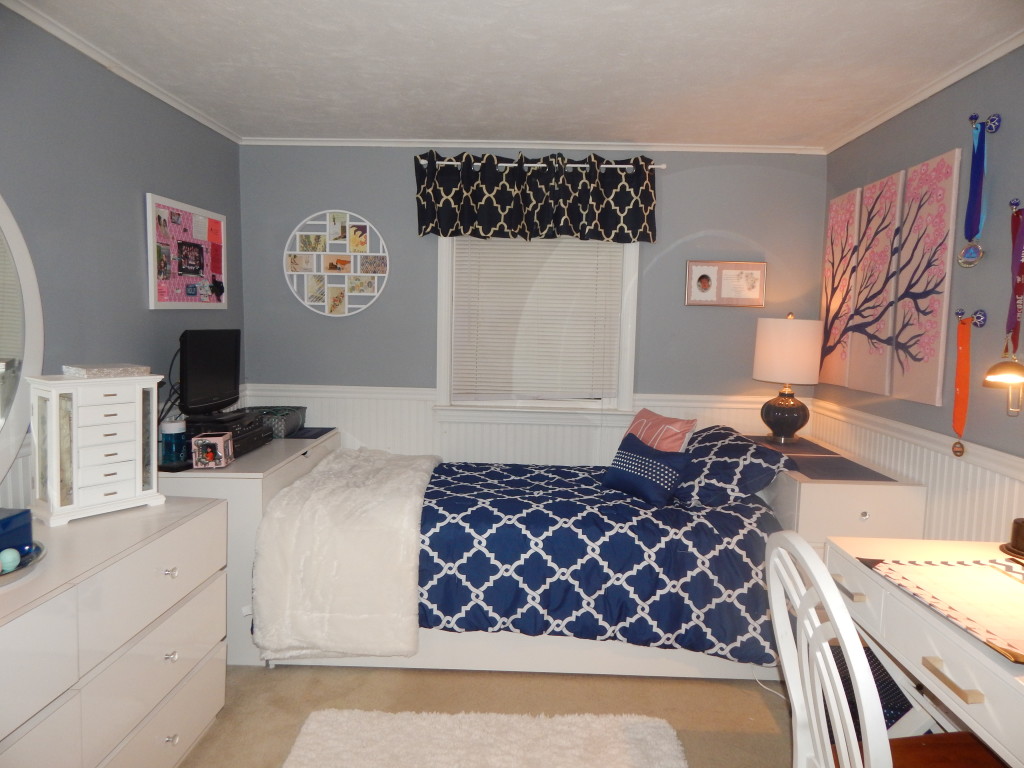
By centering the bed on the window, there is now more floor space in the center of the room - giving the illusion of a larger space. It also makes the bed a focal point. I also centered the desk on the window as well. The desk doubles as a vanity area too by adding a storage organizer for curling irons and brushes. A navy storage cabinet was added next to the desk to hide away hair products and make-up.

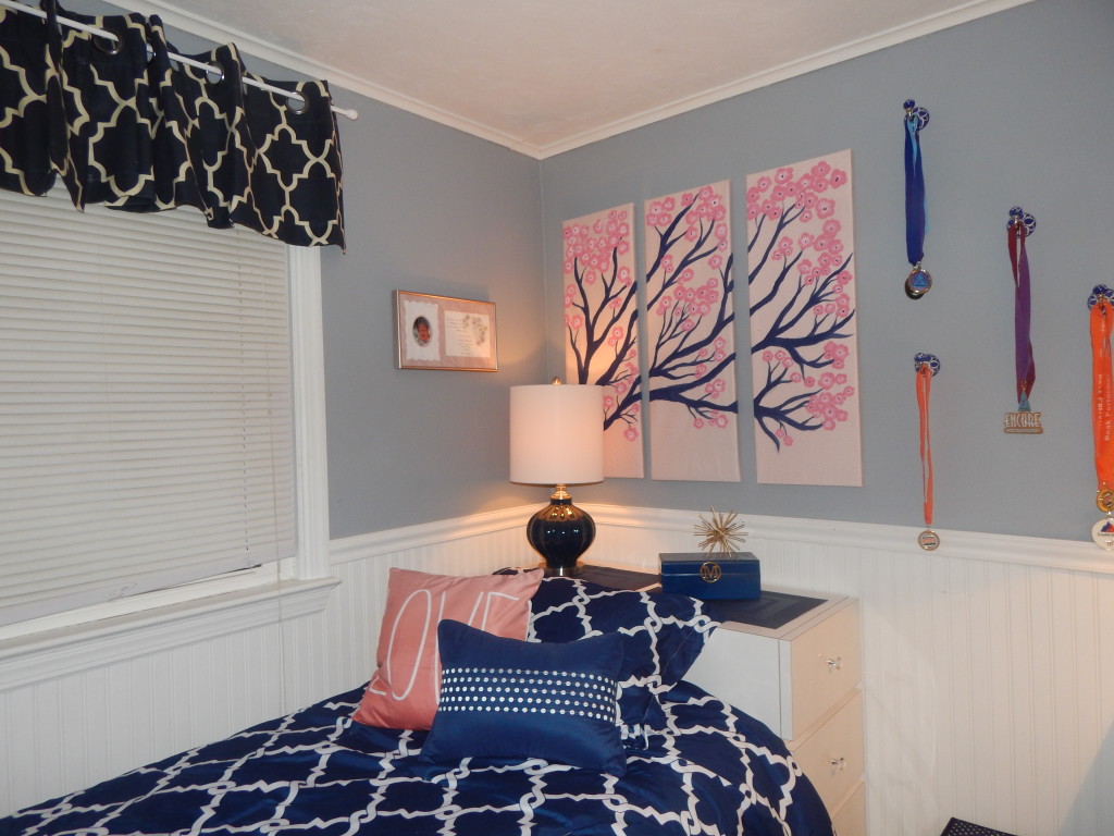
The polka-dot wall decals were removed, but the wall color remained the same. The window treatments and bedding were all updated. New lighting, the white fluffy area rug, and accessories were added to the space.

To display Medals and Ribbons, I added blue and white ceramic decorative hooks to hang all the teen's accomplishments.

DSCN0164

DSCN0165 DSCN0167

A little updating can go a long way. Does your space need a refresher? What can you switch out or add to make your space feel "new" again? Need help with your space? Send your photos to info@byamadesigns.com and we can discuss your space.

Want more design inspiration? Sign up for The A-List and receive monthly issues of my E-Magazine, The Designed Life which is filled with inspiration for the home and life. Receive a Free Design Guide when you join the A-List.

3 Tips to Create a Fab Foyer

The entry of your home is the first thing your guest see when you invite them into your home. As the saying goes, "First impressions are formed within 7 seconds." Create a lasting impression in your foyer that expresses your personality in a nut-shell. Show off your individuality but don't show all the goods ... shhh, save that for the rooms. My dream foyer would be packed with bold style, sexiness, gold accessories, lucite, a statement chandelier, and Mongolian fur ottomans. At least, that's what I am dreaming of right now - it changes.

This blog post was inspired by the powerful statement foyer that I found in the House Beautiful magazine (picture below). Isn't it drop-dead stunning? My eye was immediately drawn to the wallpaper. I love the citrus and blue tones in the pattern. Not to mention the pedestal table that literally was screaming my name.

favorite

Although the wallpaper is bold and in-your-face... the stair runner is neutral and creates a sense of balances. The solid gray grounds the space, giving your eye a place to rest. Next, is the gold pedestal base table; a stylish twist on a classic. It fills the corner nicely. The staircase is almost hugging the table. The accessories are simple and the florals draw your eye up towards the rest of the staircase and towards geometric pendant.

Are you anxious to learn how to create your own fab foyer? Inspired by the photo, there are three tips to keep in mind while designing your foyer. Let's break it down, shall we?


1. STYLE - Enter your home with style! Design your foyer by starting with largest item. Carpeting in most spaces will dictate the design. Stair runners and area rugs are a great way to introduce color and pattern into your foyer. Or opt to be different and add decorative wallpaper in your entry while keeping it neutral on with the carpet. Add a funky console table with a statement mirror above it. Reinvent an old table lamp and make it bold with a new lamp-shade. Strategically place florals, trinkets, picture frames, and other decor that will catch your eye as you enter the home.

Entry Storage

2. PERSONALITY - You should feel welcomed every time you step foot inside your home. Add accessories and details that represent your personality and/or family. Whether it be pops of your favorite color, a traditional chair for putting shoes on, or that animal print rug you always wanted - get creative.

entry 4

3. FUNCTION - Aside from being stylish and pretty, it has to be functional for your lifestyle. Place a small decorative tray on your console table for a spot to leave keys. Tuck away stools underneath your console that could easily slide out if you need to put your shoes on. Hang a decorative mirror for those last minute looks before you leave the house. Add a cute but functional Hall-Tree or hang hooks behind the door for your every day coats that are easy to grab-and-go.

entry 3

I just realized that the acronym for these three rules is SPF! That should be easy to remember! :) Get your SPF on and rock on. For more inspiration to create a fab foyer of your own, please check out my "Fab Foyer" board on Pinterest.

https://www.pinterest.com/byamadesigns/fab-foyers/

Why Glass Tile Should be One of Your Top Choices

From kitchen back splashes to shower walls, glass tile is a top contender. It is available in every color under the sun plus it comes in various shapes from intricate mosaics to classic subway tiles. The various selection and colors make glass tile an easy choice when it comes to finding your style. Glass tile is even sold in sheets for easy installation if you are going to DIY. Some sheets of tile even feature glass mixed with stone or metal for a more custom look.

Environment conscious? No problem! Most glass tiles are made from recycled glass.

I love the touch of glamour glass tile adds to a back splash. I am currently using reverse-painted glass in a wavy texture for a kitchen backsplash. When the under cabinet lighting is installed it will add the perfect amount of shimmer! For a spa-like look, consider covering an entire wall or even the bathroom with glass tiles.

HELPFUL TIP: Clean glass tiles with 50-50 mix of water and vinegar and wipe clean with a cloth to prevent scratching.
HELPFUL TIP #2: When installing a mixture of tiles such as glass and stone, choose a tile that is the same thickness.
Here are some of my faves <3 It was so hard to choose!
tile
LEFT COLUMN TOP TO BOTTOM: Tile Bar Allure, Tile Bar Highland Kensington Mosaic, Hirsch Glass Vogue, Hirsch Glass Signature
RIGHT COLUMN TOP TO BOTTOM: Mosaic Tile Direct Basketweave, Artistic Tile Flapper Floral, Hirsch Glass Silouhette, Artistic Glass Foliage

Lots of Living for a Small Space

  Living in a tiny space poses an issue. How can you store all of your stuff, make it functional, comfortable, and stylish all at the same time?  Keep in mind these 5 tips when decorating your space.

1. DON'T OVERFILL YOUR SPACE

Just like the saying, "less is more" the same concept can be applied to your home. Leaving more open space makes the room feel larger. Try not to fill up your space and leave a little wiggle room.

less

2. BIG PIECES THAT MAKE A BIG IMPACT

It may seem counterintuitive, but surprising larger items can help a space feel bigger. For example, hanging an oversized painting above a sofa can visually enlarge a space.

lr art dr art

3. EMBRACE TRANSPARENCY

Lucite or glass furniture gives the illusion of more space. Try using a lucite desk for a barely-there look that is both functional and stylish.

lucite

4. HIDE WORK PROJECTS

Carve out a place to work and a special place to tuck away reminders of projects so the rest of the day is free to relax and enjoy living. Instead of creating piles around the house (I'm guilty of this), leave a storage box handy to safely store your work items.

file box

5. VERSATILE FURNITURE

What is better than a piece of furniture that has more than one purpose? Multi-functional pieces work in your favorite when it comes to small interiors. Storage ottomans, nesting tables that can be separated and used around the room, and even a coffee table that can be converted into a dining table.

cocktail table

High-end Interiors without the High Price

I lust for luxurious fabrics, sparkling accessories, and jaw-dropping designs that are showcased in Hotels or high-end interiors. I admire streamlined and serene design or high-contrast color interiors. So how do you achieve a luxe look without the high-end budget? I will tell you how!

How to Get the Look:

Faux Custom Curtains - I am a big believer in window treatments. Custom designed curtains are like the scarf that ties your entire outfit together. By adding a decorative trim or tape to store-bought curtains, it will take your curtains from standard to extraordinary! It will also create a more high-end and custom designed look.

0948343644f282a7ef8fc399ab636edb


(Photo from Style at Home)

584af9417448950c16b8d09f326dd2ea

(Photo from chinoiseriechic.blogspot.com)

High Contrast Doors - If your wall color permits, painting your doors a semi-gloss black will take your bedroom or hallway up a notch. There is something oh so sexy about high-contrast interiors. Black and white hues scream "chic". I have also seen really dark walls, depending on where the application is, it can really look drop-dead gorgeous, if you dare!

7c8bf4d961e386e47a0c742e13089499

(Photo from Apartment Therapy)

Flowers - Something about fresh flowers can make a home feel so welcoming. Maybe because we often use fresh flowers for special occasions? I am all about the flowers, but not about the maintenance. Girl, nobody's got time for that! Polyvore, Michael's Craft Store, and Nearly Natural, have some great faux alternatives. You can even thrift vases and spray them white or gold. My personal favorite right now is mercury glass vases - so glam.

Screen Shot 2014-11-20 at 10.52.50 AM

Fluffy Pillows - You might be thinking, "What is this girl talking about?" The softer, the plumper, the better. Add pillow inserts that are larger than the actual pillow size for a more volumized look. I love the down inserts. If you have allergies, there are some great hyperallergenic alternatives that are available in the market.

Screen Shot 2014-11-20 at 3.21.59 PM

(Photo from emilyaclark.blogspot.com)

Hotel Style Bedding - Crisp, clean, white linens just ooze luxurary. I love the Restoration Hardware bedding or the Matouk Bedding from Bloomingdales.

Screen Shot 2014-11-20 at 3.16.25 PM

Chunky Crown Moulding - Thick crown moulding adds architectural detail to your space and also draws your eyes upward to give the illusion of a higher ceiling. I must admit, the beautiful and thick molding can add up in price. I did find on pinterest an amazing trick if you need a more budget-friendly option. Check out how to cheat when it comes to creating thick moulding (the tutorial is for base moulding but the same concept can be applied to the crown).

Screen Shot 2014-11-20 at 2.58.01 PM


(Photo from sheknows.com)

Details, Details, Details - Accessories are the jewelry of your room. I'm all about the details. I love touches of gold or polished silver. If your room has more warm tones, choose gold or bronze accents. If your room has cooler tones, pick silver, nickel, or even lucite accessories. Add stylish coffee table books and a tray to your cocktail table, or even a few bone-framed picture frames. Add the details where necessary, but don't over do it! Too many accessories will make your room feel cluttered. Check out this coffee table vignette from The Glitter Guide.

Screen Shot 2014-11-20 at 10.32.56 AM


(Photo from the Glitter Guide)

black and white vignette


(Photo from Style at Home)Screen Shot 2014-11-20 at 10.32.21 AM


(Photo from Lauren Conrad)

Random Thought: Did you know that H&M came out with a home decor line? Say what?!! I am the last person to find out? I'm not sure when this happened but I am happy. The items are super cute and affordable! I'm loving the vases with the polka-dot relief detail. I saw clear vases too but I thought this ombre color glass was different! What do you think?

Screen Shot 2014-11-20 at 10.15.11 AM