You may like a lot of different styles and don't identify with one design style. Or maybe you feel that you don’t have a design style at all. But let me assure you that you definitely have a design style. If you have a personality, you have a style. You may not uncovered it yet but through some exploration you will be able to pinpoint “your unique style.”
How to Define your Design Style
Tell me if this sounds familiar: You just moved in or are looking for a new home, you started shopping around online, you made Pinterest & Houzz inspiration boards, you bookmarked all your favorite items, you watched reruns of HGTV shows, you took notes from a YouTube video on how to DIY everything, and you have been stock piling coupons for Bed Bath and Beyond like nobody's business. You did the research and you gathered inspiration but where do you start? I’m here to tell you how in this blog post!
What's Trending: Lucite and Gold Furniture
Introduced at High Point Market, lucite and gold furniture combinations are making their waves this Spring. I have always been a gold jewelry type of Gal, so I am so excited that warm metals are making their way into the home. Today, I will be sharing inspiration for the home using lucite and gold in unexpected ways. I love crisp white cabinetry in Kitchens with marble countertops, however it may feel "cold". By incorporating brass and gold metals into the kitchen, it adds a bit of warmth to the space. The globe pendant lighting and barstools in lucite and gold add a bit of glamour to this space. The scalloped antique brass hood adds unique detail to this finished kitchen.
(Image via Luxe Interiors and Design)
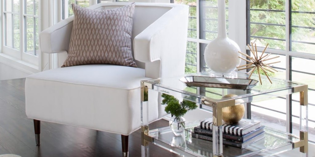
One of my favorite end tables introduced at High Point is the "Connor" end table by World's Away. Add this sexy end table next to a sofa or chair to add a bit of glamour to your living room. I would even put a pair of these babies next to each other to use as coffee tables.
(Image via World's Away)
(Image via Bernhardt Interiors)
...and for the Grande Finale! This upholstered lucite poster bed introduced by Bernhardt Interiors. WHAT A SHOW STOPPER!
I am loving this trend and I hope you are too. Lucite furniture can add a little bit of glam to any space. The "barely there" furniture trend works well in small rooms since it does not obstruct the view and gives the illusion of a larger space. Whether your home is big or small, this is a trend that can be suited for any home.
For more design tips and monthly design inspiration, join our newsletter to receive a free Home Design Guide and other goodies exclusive to The A-List.
Experiment with Color: Fall 2015 Trends
Refresh your home's color palette with warm, earthy, or saturated tones to warm up your interior during the cooler months ahead. Today I will be sharing a combination of color pairings and how to incorporate these shades into your home. I am going to break this post into personal color preferences: Neutral, Playful, and Bold .. Scroll down to the color palette that you gravitate to.
For the Neutral Lover
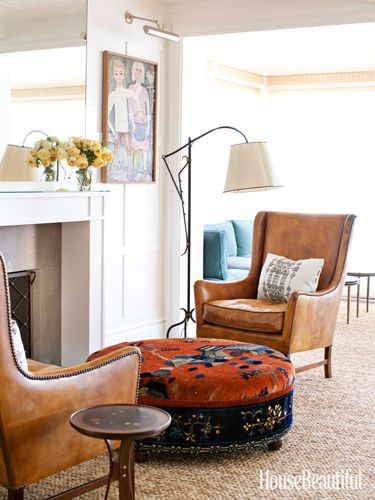
If you love neutral colors, try incorporated shades of "Cognac" into your home. Warm whisky browns that have a reddish tint pair well with other neutral shades. The warm autumn shade can be incorporated with wood furniture finishes and/or fabrics like the warm whiskey brown chairs featured in this eclectic living space.
(Image via House Beautiful)
Taupe and mink brown are a great choice to use as neutral to balance any color palette. I prefer taupe over gray because it is earthy and creates a warm inviting environment when used on walls. (Love taupe so much that it is my current Fall nail color right now)
If you are searching for a muted color, try using mauve in your home. Mauve is a toned down purple that compliments well with warm browns, deep plums, and crisp whites.
Blush pinks and soft rose shades are colors that can be worked into your home. They marry well with rich blues or beiges and creams. For paint colors, select a white with a tint of flesh tone pink for a touch of warmth to a crisp white.
For a deeper neutral color and an alternative to dark brown, try experimenting with the color "Marsala". Marsala is a rich brown-red hue and also the Pantone 2015 Color of the Year. Definitely one of my favorite shades. I love how the marsala sectional grounds the space in the photo below. Read more about this color in detail.
(Image via Belgian Pearls)
For the Playful and Cheery
If you like bright cheery tones, use Pantone's "misted yellow" which is a muted yellow with a green tint. It is the fall version of a cheery yellow. If you are looking for a yellow without the green tint, I like using mustard as an accent color in accessories or fabrics. Mustard marries well with rich brown, vibrant teal, charcoal gray, and even black.
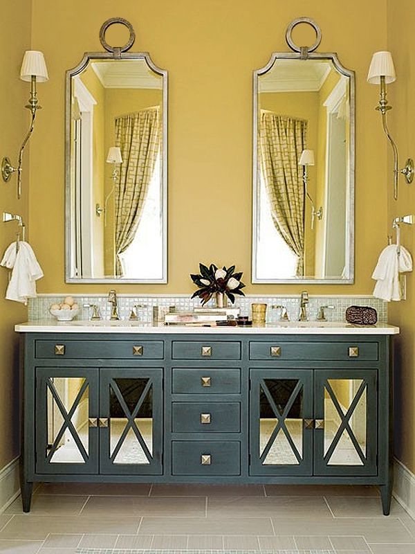
(Image via Digdigs.com)
Another cheery pop of color to try is Pantone's Amethyst Orchid. A vibrant jewel tone that is strong enough to be a statement color or can be used sparingly with accessories or flowers. Amethyst Orchid can add a lot of energy to a space when paired with red or another vibrant hue but when combined with gray it adds a soft playful pop of color.
Cypress green is a color that I am seeing more lately. I've seen it on walls, furniture, and even kitchen cabinets. Cypress is a soft soothing green but when mixed with a neutral color palette it can add a crisp pop of color. As the leaves begin to fade, shades of green can evoke a feeling of nature when added into your home. Cypress green and forest green are two shades to experiment with this winter.
For the Bold and Daring
If you are feeling daring and want to explore using saturated hues, here are a few:
Aurora red: A cross between orange and red. Reminiscent in the fall leaves. This shade is perfect for Autumn shade. Whether you use this shade in small ways or big ways, this color is bound to make a statement due to the density in color.
Pumpkin: If you aren't ready for the commitment of red, try using shades of pumpkin or a paprika spice. Burnt oranges add warmth to charcoal grays and compliment taupe or chocolate browns. In the photo below, the pumpkin hue adds warmth and color to this cozy bedroom but isn't overpowering.
(Image via Ericcrossinteriors.com)
Not quite blue, not quite green: Teal is a beautiful gem tone that is vibrant and mixes well with warm shades like whiskey brown. I love how the mid-century modern chair pops against the rich teal walls.
(Image via mod-home.info)
Rich violet, Sangria-like shades are rich shades that can create intimate settings when used on walls. I love seeing deep violet or cabernet-like shades in dining rooms. I feel like it creates a warm dinner setting. Whether used in a big way on walls or in smalls doses, this shade is sure to warm up any space.
So which shade will you be experimenting with this fall? Will you be going for a cheery, bold, or neutral look? Comment below :)
Want more design tips? Join "The Designed Life" monthly e-magazine, filled with tons of inspiration for the home and life. Also, receive a free Home Design Checklist to make your next shopping trip for your home easier.
Fall DIY Burlap Wreath
It's been a while since I have crafted. Since, it has been cold and rainy, I thought it was the perfect time to pick up some supplies and create an easy Fall DIY project. I'm a big fan of simple crafts that aren't time consuming yet look like a million bucks after you complete them. I made two wreaths in one hour (not bad). I made one as a gift for my grandmother's 80th birthday. I can't wait to surprise her with it.
For this project you will need:
(1) 12" Wire Wreath Frame (you can choose a bigger size but for beginners, start small)
(1) Roll of 4" wide Burlap (20 ft. Roll)
Ribbon of choice to hang wreath
Flowers and Accessories of choice to decorate
Hot Glue Gun
Fall Burlap Wreath DIY
How to Create a Burlap Wreath Step by Step
Preheat your glue gun before starting
Tie a knot to start and to prevent the ribbon from sliding while you work
Weave loops from section to section. Start from the top row and weave your way to the bottom row then weave back up to the top row until you complete the section.
Continue step 2, until you weave your way all the way to the end.
Tie a knot to complete
If you are using fake flowers: pop the flowers off the stems
Arrange your flowers on the wreath to your liking
Hot glue all the accessories in place
Beginner Mistake: This was my first fall wreath DIY project. To me, 20 ft. of Burlap sounded like a lot. I thought I could make two wreaths from that one roll and but it wasn't enough because I made my wreath full. After wreath 1, I only had a couple feet leftover. For the second wreath, I used a smaller roll of burlap. I actually hot glued the loops together to hide the frame and make it look "fuller" than it actually was. I ran out of burlap at the end and "faked it" with some large flowers. Learn from my mistake, if you run out of burlap.. it's not the end of the world. Glue the loops together to hide the wire frame and use large flowers to cover gaps. Here is the finished result of the other wreath:
I hope you have enjoyed this tutorial. Please tag @byamadesigns on Instagram if you have decided to attempt this DIY project yourself! I would love to see the beautiful wreaths that you have created.
If you loved this post, please share it with a friend!
Happy crafting,
Amanda of AMA Designs & Interiors LLC.
How to Shop for Furniture
Are you ready to redecorate your space but not sure where to start? Well - I am glad your here! In today's Tip Tuesday post you will learn how to shop for furniture, how to assess your needs, what to look out for when shopping for new furniture, and how to avoid mistakes.
How to Shop for Furniture: Where to Begin
Assess Belongings - Before you go shopping, create a note of what existing items are staying, going, and what new items are needed/desired. Assess what is worth keeping and what items you are ready to let go. Also keep in mind the furniture that is in good condition but may need to be freshened up by reupholstering or refinishing with a new coat of paint.
Create a Cheat Sheet - Goto the store prepared by bring clippings of paint colors, fabrics samples, and pictures of items you are working with. Bring inspiration photos to glance at while shopping to remind you of how you want the end result to look and feel. Shopping can be overwhelming and it's easy to get distracted. Bringing a cheat sheet while shopping keeps you on target.
Plan Ahead - Measure your existing space and items that you will be keeping. Draw the general shape of your room and see if you could reconfigure the layout in a way that works best for you. Now is the time to nail down the details of what size furniture works best.
* Side Note: Measure all important doorways/entrys and hallways to confirm furniture can fit into the space. Nothing worse than buying furniture that can't fit through the door.
Scale - This ties in with measuring... A piece of furniture may look great in a showroom with high ceilings but when you bring it back home, it may overwhelm your space. Measure the space and tape out and block the furniture on the floor to make sure it fits in the room before you buy it.
Budget - Create a spending plan of how much you want to spend in total. Do not forget to factor in additional fees such as warranties, protection plans, installation/assembly, and inside deliveries.
Additional Tips:
- When purchasing upholstery, upgrade seat cushions to foam wrapped with down. Invest in pieces that are most important (i.e. the sofa) instead of rarely used items. The heavier the cushion, the longer it will last.
- Furniture is a large investment. Select furniture that is timeless and transitional.
- For case goods, look for dovetail joints in the corners of drawers for long-lasting quality.
- For upholstery, lift up a corner and shake it, if it feels light or wobbly; skip it.
Want more design tips? Join "The Designed Life" monthly e-magazine, filled with tons of inspiration for the home and life. Also, receive a free Home Design Checklist when you join.
Receive a free Designer's checklist to help you prepare for your first shopping trip. Get your free checklist, here.
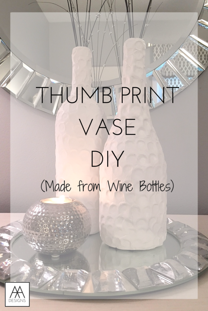
DIY Thumb Print Vase
Hello everyone! It's been a while since I have posted a DIY. I have been busy creating drawings and paintings, but I haven't actually made a "craft" in a while that I could share with you.
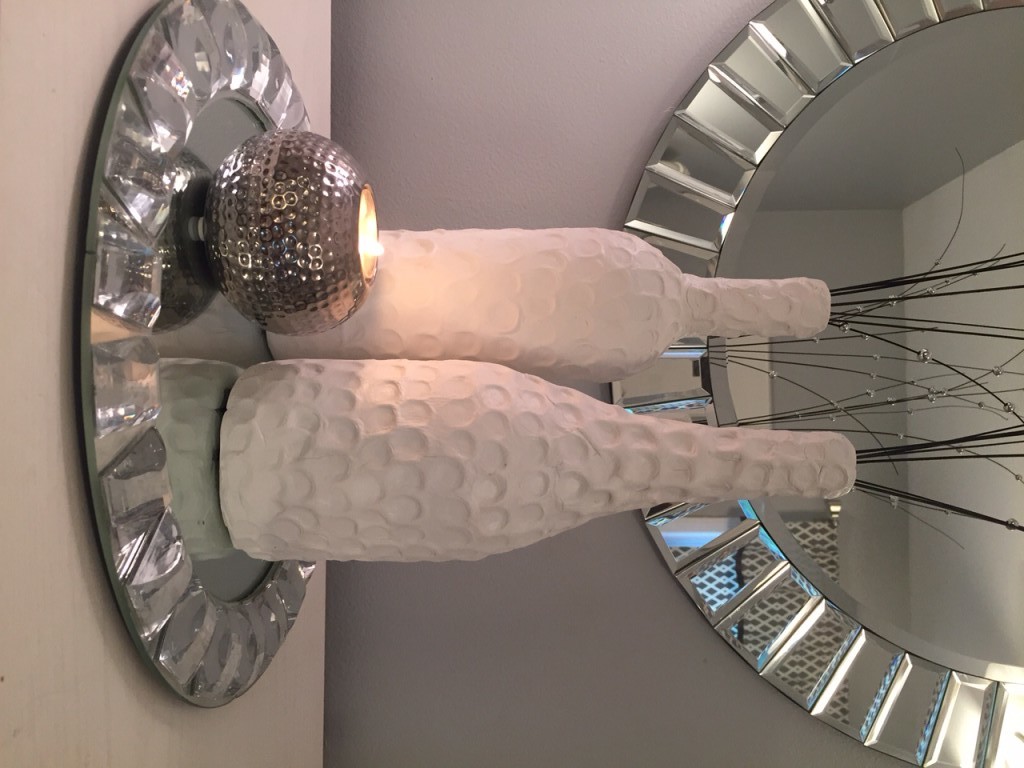
I wanted to create a bottle that had an all-year round design, texture, and that was sculptural. So I have created a vase that I have wrapped in Air-Dry Clay that I purchased from Michaels with a coupon. Woot woot!
For this Tutorial you will Need:
- A Wine Bottle or Canister of your Choice
- Air Dry Clay (I used White so I could spray paint it if I wanted to)
- A rolling Pin
- Exact-o Knife
- Thumbs ;)
Step-by-Step Tutorial
Step 1: Select bottle
Step 2: Clean Bottles and take off labels with Hot soapy water
Step 3: Roll out Air-dry clay into a big rectangle (easier to work with). Roll out thin
Step 4: Wrap clay covering as much of the bottle as possible
Step 5: Cut off Excess clay with Exact-o Knife
Step 6: Use Excess clay to cover top of bottle
Step 7: Blend in creases with your fingers the best you can by using a rubbing or patting motion. I also rolled it on the table to even out the clay.
Step 8: Take your thumb and apply pressure to the clay to make rows of thumb prints starting at the bottom until you reach the top.
Step 9: Let clay air-dry for 24-48 hours (varies upon thickness)
Step 10: Spray paint bottle in the color of your choice and/or add branches/flowers for decoration
Here is the finished result!
Want more design tips? Join "The Designed Life" monthly e-magazine, filled with tons of inspiration for the home and life. Also, receive a free Home Design Checklist to make your next shopping trip for your home easier.
Top 10 Summer Colors for the Home
In this weeks blog post, I am sharing the top 10 summer colors for the home and how to decorate with color. I love decorating with color, especially during the summer with all the playful and bright colors. If you're looking to experiment with color this season, stick around! I will be sharing the Top 10 Summer colors this year and how you can use them in your home.
Top 10 Summer Colors for the Home:
1. Citrus Lime - One of my favorite summer colors. This color is better in small doses. Play with this hue by using it as an accent color for smaller accessories or in artwork. To compliment this bold hue, pair shades of lime with neutrals like beige or taupe.
(Image via HGTV House Tour)
2. Ice Blue - Ice blue tones are great for creating a serene environment. This color can be used on larger pieces like curtain panels, area rugs, bedding, and walls.
3. Coral - Coral is a strong hue that is part pink and part orange. This playful and bold color will energize any space. To balance the density of this color, try pairing it with navy, beige, or even ice blue.
(Image via House Beautiful)
4. Orchid - Orchid is a beautiful color to mix with white or grey. Couple Orchid and Orange throw pillows together for a playful and cheery look on any sofa. Orchid also pairs well with deep teals and peacock blues which balances this lively hue.
5. Classic Navy - Navy is the new black. Navy has become one of the hottest neutrals to use in your home. Navy is so versatile. It could be used as an accent color, a wall color, or as a neutral to balance bold colors.
6. Turquoise - I love turquoise accessories especially for outdoors. There is something about pairing lime green and turquoise that instantly reminds me of "summer". Aside from being outdoors, turquoise can be a great indoor color as well. I used this turquoise and white in a Teen bedroom I designed.
7. Yellow - Sunny yellows instantly perk up a space. Check out the yellow wallpaper that was used in this foyer - I would love to be greeted into this space! Great for spaces that you need more energy such as a work-out room or office. Cheer up your space by adding pops of yellow in a grey or white room.
(Image via Centsational Girl)
8. Crisp White - Crisp whites is an everyday basic. Use white as a backdrop to display art, collections, and other decor. Let your accessories showcase your personality and add life to the space. For a sophisticated and clean design, consider a monochromatic room in all white.
(Image via View Along the Way)
9. Orange - Orange has always been a summer favorite. Shades of orange can be used in rooms to promote activity and energy. Add pops of orange behind bookcases in an office or use tangerine as an accent furniture color like the living room below.
(Image via Better Homes & Gardens)
10. Blush Pink - Blush tones make wonderful neutrals or soft feminine accent colors. Blush pinks soften dark harsh colors like black and other deep tones.
I hope you have enjoyed this post. I encourage you to play with color in your home. Color transforms your space and how you feel when you walk into the room. Which color will you choose to welcome into your space? Share below.
Want more design tips? Join "The Designed Life" monthly e-magazine, filled with tons of inspiration for the home and life. Also, receive a free Home Design Checklist to make your next shopping trip for your home easier.


